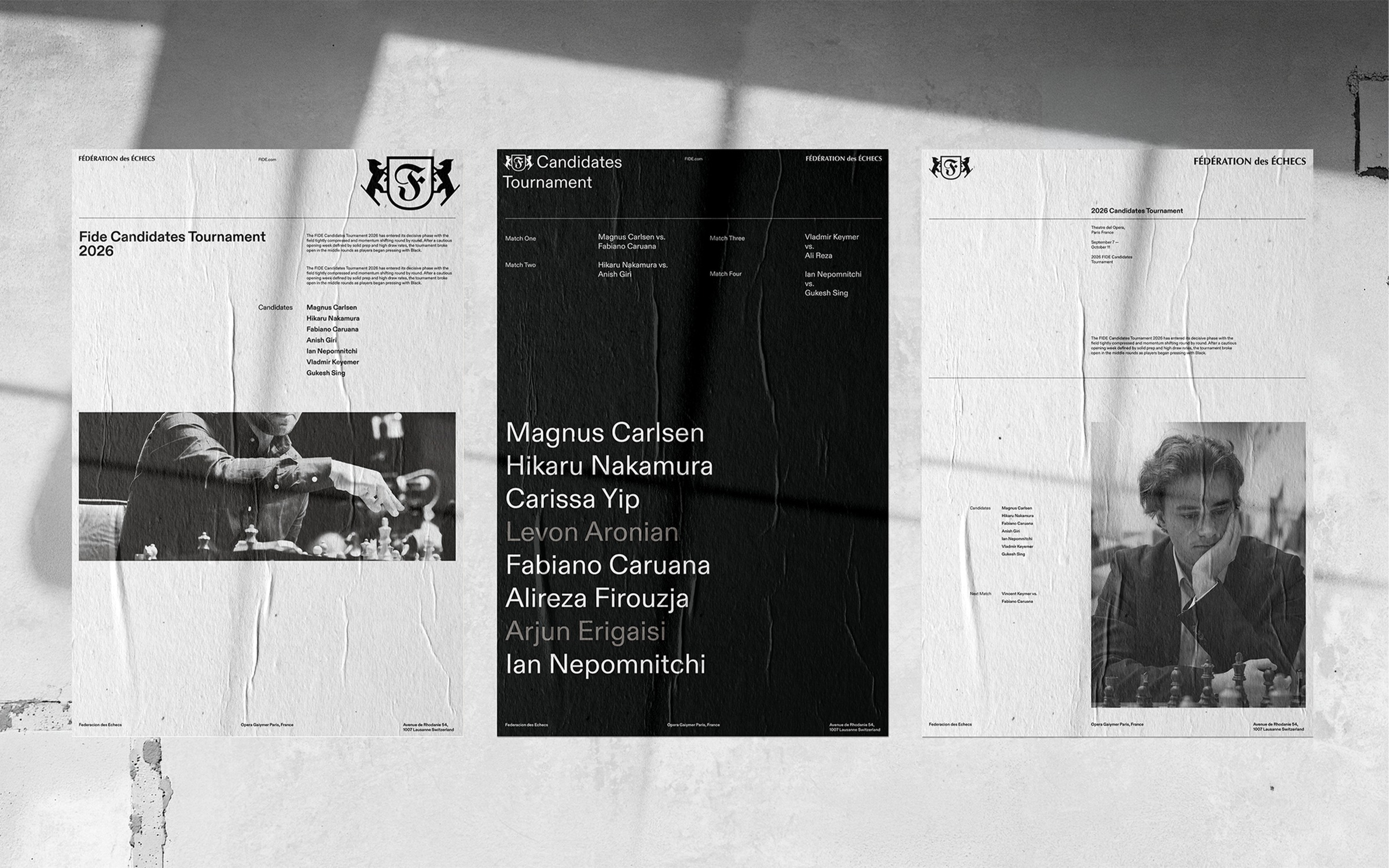
The conceptual FIDE rebrand explores how a highly recognizable institution can be rebuilt through a limited visual system without losing its authority. The project began with the challenge of modernizing the identity of the International Chess Federation while retaining the structure, discipline, and competitive intelligence associated with the game.
Gerbert Sans is a font developed as an exercise in understanding typography at its most fundamental level. Designing each character forced me to look more closely at details I had previously encountered primarily through typesetting: proportion, spacing, stroke relationships, optical correction, rhythm, and the relationship between individual forms.